For some reason, a lot of businesses take their website for granted. In many cases, they just don’t realize the power their website can have and how it can benefit their businesses.
Because of this, there are a ton of businesses out there that have a website, but it’s bare, confusing, outdated, or just plain useless — as in, maybe you can type in the URL and get to the website, but once you get there, there’s not a whole lot going on. That’s not helpful for you as a business, and it’s definitely not helpful for your customers!
Is Your Website Working for Your Business?
If you ever look at your website, traffic, or stats, it can be a little confusing because it’s got all kinds of data everywhere. But what you’ll find is that you have a lot more people visiting your website than you do actually contacting you.
So, whether it’s a hundred people or a thousand people or 10,000 people visiting your site over whatever period of time, only a very small percentage of those people are picking up the phone to call you, emailing you, filling out a form, or engaging in a live chat to find out more about your product or service.
Those are about the four ways that somebody might reach out to you. A lot of times people come to us and they go, “Hey, how do we get more people to come look at our website?”
Most of the time, they’re thinking about search engine optimization (SEO), social ads, or paid ads. And all those things can be great things, but what really helps in many instances is improving the website itself.
Why? Because if you drive tons of people to your website, but nobody takes the next step because it either doesn’t look right, doesn’t compel them with messaging, or whatever it may be, then you’re just wasting your time on paid ads or search traffic. Doing things like this without a good website in place is like lighting your dollars on fire — don’t do it!
You have to get your website right first before you do anything else marketing-wise.
We say this a lot, but it’s worth saying over and over again: Your website should be your best salesperson. It should be bringing in leads and moving them along toward your product or service in a very clear way. If a prospective customer is on your website, they may actually want to buy from you. Your website should make buying from you easy and clear!
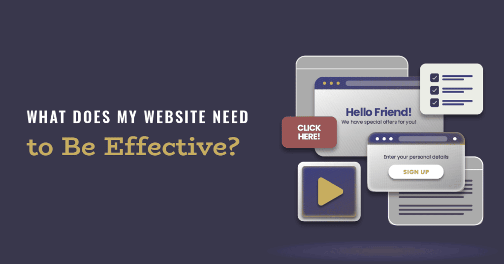
5 Things You Could Be Getting Wrong on Your Website
You wouldn’t show up at a business meeting looking like you just rolled out bed in your pajamas if you knew tons of people would be, or an ideal prospect. And yet… a lot of websites kind of look like that, like you just kind of threw it together as an afterthought.
Your website is an opportunity for your business to grow, but most businesses miss it, or don’t even know it. So often, we see people spend hundreds of thousands of dollars building out an office or something like that. And then they’ll put a horrible sign out front or they’ll spend a ton of money on their website, but they won’t hire a photographer to get good photography on it, which can make all the difference.
To be clear, it really doesn’t matter what kind of business you’re in. We’ve done websites for businesses that sell gutters on houses and businesses that sell mega-million dollar real estate. Regardless of what you sell, your website should be helping you in your sales process.
- Messaging.
Your message is more expansive than just your website because it affects your whole business. But when you go to people’s websites, you’ll often see that businesses spend too much time talking about themselves, or trying to be cute and clever, which affects clarity.
Your website should make it simple for a customer to do business with you. So, right off the bat, you should tell them:
- What you offer (your product or service)
- How it can make their life better (the benefits of what you offer)
- What they need to do to get it (one clear call-to-action)
- CTA (Call To Action).
There may be several things a prospective customer can do to engage with your business, but your website homepage should only focus on ONE thing. A lot of businesses have multiple CTAs all over the place. You’ll go to a website and see “Contact us,” “Shop now,” “Learn more” all at once, on the same page.
Imagine being a prospective customer, someone who has never seen your website before and has no clue if your business can help them. They want to find out more, but you’re telling them to do three different things. How do they know what to do? Most of the time, they don’t, so they leave, and you miss out on the sale.
Your CTA is the next step you want prospective customers to take. Once they land on your website, what’s the first step in the sales process? That’s what you want your CTA to be. It may be “Shop Now” or “Contact Us.” Whatever it is, make sure it’s simple, clear, and consistent.
- Navigation Menu.
Businesses get stuck on this a lot because they want to share so much with their customers, but simplicity and clarity really go a long way on your website, and that includes on your navitation menu.
There’s nothing wrong with providing information, and you can have more pages on the website, but as far as prime navigation menu goes, there should be a maximum of seven items. What those seven items are really depend on the industry you’re in and what your customers are after, but they typically include the following pages:
- About
- Products/Services
- Blog/Resources
- Contact
- Design.
The design quality of your website matters. A lot of people will go out and buy a cheap template that they throw their logo on and call it a day. Again, you wouldn’t show up at a business meeting in your pajamas, so your website needs to look better than that, too.
Other people — including your ideal customers — are seeing this when you’re not there. What kind of presentation are you putting out there in the world?
Many times, we hear businesses say that they work off of referrals, so they don’t need a good website. Well, here’s what happens when somebody tells somebody else to go check out your business…
They Google you!
Design builds trust, so make sure what you’ve got out there is a good representation of your business, your offerings, and how well you serve your customers.
- Optimization.
A lot of people make the mistake of having a website that’s not optimized for mobile (phones). They think that website equals computer, but that’s not always the case. In fact, more often than not, that’s not the case. This is especially true if you have a physical location. Many people will find you through map applications on their phones.
And while yes, there are plenty of people still looking at websites on their computers, at least 50% of your website traffic will come from phones. With this in mind, it’s important to have your website optimized for speed and appearance on mobile.
Make It Better: Implement Some Changes Today!
You can go back to your own website right now and look at those five things: messaging, CTAs, menus, design, and optimization. When you do, think about what you can make better. If there are things you can improve right off the bat, great! You should do it. Whether you fix these things in-house, through us, or with another company, make sure you start making improvements today.
Even if we built it — hey, it can always be better. That’s the beauty of a website! It can just get better and better over time. At Business Builders, we’re all about continuous improvement, so we encourage you to make some changes to your website today.
Feeling confused and overwhelmed by it all? Get into a blueprint with our team. It’s where every good website starts for our clients, and we’d love to help you grow your business.
Click here to get started with our StoryBrand Certified Agency.